Every couple of years or so it's certainly worth considering how a web site performs on today's browsers and devices. We have seen a sharp increase in the use of mobile and tablet
devices, while users are becoming more experienced. You need to deliver your content in a way which is user friendly or you'll lose those visitors, fast!
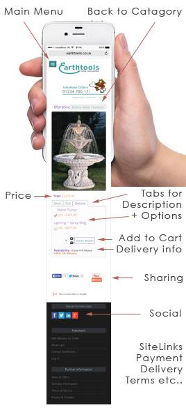
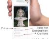
When we built this E-Commerce web store for earthtools.co.uk they wanted the browsing and purchase of goods to be smooth and efficient. We modified the cart to create tabs within product details, so on a mobile device the user did not have to scroll on and on. The product picture(s), information and buy options are all very conveniently located. You are not bombarded with information on arrival on these pages, however further information is there if required.
Also, the user experience on smart devices is finger orientated, so pictures to click for categories etc are a blessing. Keeping in mind the search engine optimisation of the site, text is added to cover the content. Formatted with correct tags and sensible keyword density. We also thought from a user perspective it would work well to use one colour for headings/Cats etc and another for links, making navigation more friendly.
Since uploading the new site Earthtools has noticed an increase in traffic and upward movement on Google searches. In addition, when a search is performed on a mobile device, Google now adds mobile friendly under the listing.
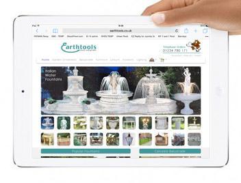
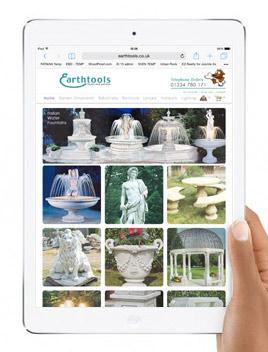
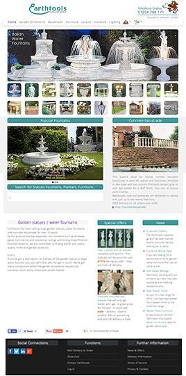
The images below show the site on various devices.